Graphic Design

Today I will be discussing the four principles of graphic design with regards to the Massachusetts Institute of Technology website.

Untitled

(click)

1. Proximity – This could be much improved. While the page is sectioned, the content layers over the text and the animated gifs which leaves the site looking messy. These elements would look better placed on the page separately.

2. Alignment – There is no evidence of a set alignment here as the content and the text elements are scattered. A center alignment would be much more appealing.

3. Repetition – No repetition is present as each link/button on the site takes you to a completely different looking page. Tabs along the top that continue in each page would be much more efficient.

4. Contrast – The blue text overlaying the black gifs and content give poor contrast leaves the eye wondering where to focus on. Blue and white alone would allow

Overall this website design is poor and leaves a lot to be desired when the four principles are applied.

Thanks for reading.

Website Usability and Accessibility

Today I will discuss the usability and accessibility of the Cork County Council website. Usability assesses how easy the user interface of the website is to use, while accessibility is the degree to which a service or product is available to as many people as possible.

Usability

I will examine the usability of the Cork County Council website using the 5 E’s:

1. Effective – This website is very effective and communicates the purpose of the site very well by displaying relevant logos and tabs up at the top of the page.

2. Efficient – It is easy to navigate around the site to complete any tasks you may wish to complete with efficiency. The tabs along the top of the enable the user to use the site with ease.

3. Engaging – In my opinion this website is not designed to keep a user on the site longer than they have to. Its basic design doesn’t engage a user for very long.

4. Error Tolerant – After navigating around the site for a few minutes I think the site is easy to use and can’t imagine many errors occurring here.

5. Easy to Learn – The general structure and layout of this site is simple which would allow a user to learn how to navigate through the site with ease.

Accessibility

With regards to design, the Cork County Council website is quite accessible. The colour contrast in the design allows for easy reading. However I think the site is lacking an easy way to change the font size if the reader needs it.

The structure of the site is easy to follow. The tabs along the top allow users easy accessibility. There is also a button labelled ‘Accessibility’ on the top of the page which shows the sites policy and gives a point of contact if you feel the site is lacking accessibility in some way.

Thanks for reading


Kevin Kelly: The next 5,000 days of the Web

In the following video (dated 2008), Kevin Kelly makes a fun statement: The World Wide Web, as we know it, is only 5,000 days old. Now, Kelly asks, how can we predict the next 5,000 days?

It is amazing to watch this video in 2013 and realise how many things Kevin Kelly was right about and how predicted many of the great internet applications that we have grown accustomed to today.

Even back in 2008, the interent had a huge of traffic and usage. Here are a few very interesting statistics (2008) that caught my attention whilst watching the TED talk:

  • 100 billion clicks per day compared to 65 billion phone calls
  • 55 trillion links are being made/shared
  • 2 million emails are sent per second.

As much as these statistics really amazed me, the most interesting element to me in Kevin Kellys’ talk was “The Internet of Things”.

The Intenet of Things (IoT) is a vision that is being built today. A vision of a world where everything from animals, objects or people are provided with a unique identifier and have the ability to transfer data over a network without requiring human-to-human or human-to-computer interaction.

More objects today are becoming embedded with sensors and gaining the ability to communicate. The resulting information networks promise to create new business models, improve business processes, and reduce costs and risks.

Below is an image from Cisco about the IoT and what it means for society for today and in the fututre. For me, it is so interesting and almost inspiring to look at this image as it presents the question; Where do the possibilities end?

Douglas Englebart & Sir Johnathan Ive

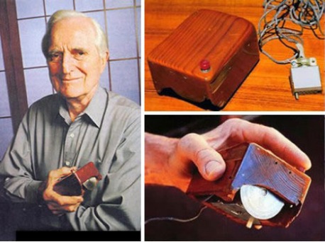
Douglas Englebart – 1950’s

Image

Douglas Carl Englebart was an American engineer and inventor best known for his work on the challenges of Human Computer Interaction and being the creator of the Mouse.

Image

In tribute to his work, video footage of the NLS online system demo from the 1960’s is kept alive on YouTube:

Sir Johnathan Ive – 2000’s

jonathanive_2096687b

Sir Johnathan Ive is the Senior Vice President of Design at Apple Inc. He is one of the most inspiring and influential product designers developing ground breaking products including iMac, PowerBook G4, iBook, the iPod MP3 player and the iPad.

jonathan-ive-and-steve-jobs

Johnathan Ive describing the design process of the Macbook:

Douglas Englebart and Johnathan Ive have both had a major impact on how humans interact with computers in two very different eras of technology. Douglas allowed the first human interaction with a user interface, while Johnathon has completely change the look and feel of a user interface bringing fresh and innovative products to the current market.

Digital Images

Image

Original Location: http://tuxpaint.org/stamps/stamps/animals/birds/cartoon/tux.png

Resolution: 400×479

Size: 40.2 KB

Format: PNG

Why: PNG is used when you need a smaller file size but do not want to lose quality. It’s a soft edge image that ideal Web graphics replacement for GIF.


Image


Original Location: http://www.sadmuffin.net/cherrybam/graphics/graphics-cartoon/mickey-mouse004.gif

Resolution: 333×432

Size: 36.4 KB

Format: GIF

Why: GIF is used for small, simple and compact web animations that have limited colours. GIFs are perfect for web buttons, cartoon-like drawings and diagrams.


Image

Original Location: http://upload.wikimedia.org/wikipedia/commons/9/96/Grand_Canyon_South_Rim_Sunset.jpeg

Resolution: 2272×1704

Size: 664 KB

Format: JPEG

Why: JPEG is perfect for photos when you are also willing to allow a reduction in quality to keep the file size small. It is not suitable for images with text, large blocks of colour or simple images because crisp lines will blur.

Entertainment & Multimedia

Multimedia can been seen in every corner of entertainment everyday. We use our computers to do everything from gaming, up to watching full length movies.

Image

 Multimedia is heavily used in the entertainment industry, especially to develop special effects in movies and animations. Gaming is a popular pastime and multimedia software programs are available either as CD-ROMs or online. Multimedia applications that allow users to actively participate instead of just sitting by as passive recipients of information are called Interactive Multimedia.
 
 
The movie Avatar took using multimedia and digital elements to a new level, even created new technology that allowed them to use real time performance and transfer it to a digital format. The technology broke digital boundaries.


The music sector in the entertainment industry also extensively uses multimedia. A band called ‘The Gorillaz’ bases their whole public image on digitally created images. They also project these images for any live performances and never reveal their true identity.


banner_entertainment_575x200